I was glad to see a Litfest and Flax blog with this lovely virtual bookshelf of the digital publications I designed for them as they were uploaded to Issu. Nice to see them all collected together, even if the two at the top left have lost some of their transparency.
Saturday, November 28, 2009
Flax books on Issu Bookshelf
I was glad to see a Litfest and Flax blog with this lovely virtual bookshelf of the digital publications I designed for them as they were uploaded to Issu. Nice to see them all collected together, even if the two at the top left have lost some of their transparency.
Friday, November 13, 2009
Mostly Truthful Postcards
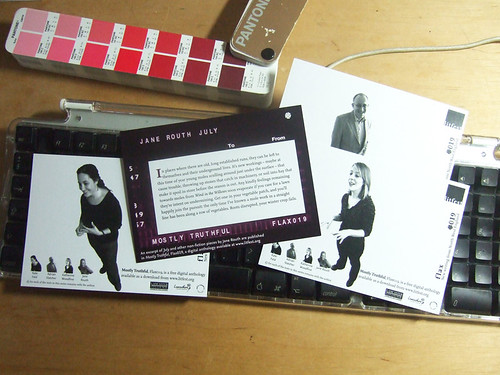
Postcards to promote Flax019, Mostly Truthful I'm very fond of the typography of the monospaced font at the bottom of the cover image.
Unsaid Undone in print

At some point in the development of Flax book's range of digital anthologies, a decision was made to re-purpose the, to offer a de-digitalised version. The digital versions were still given primacy, published first and the navigation marks left in place, but they would be printed so the audience could read them in bed, or in the bath. From Flax017, Unsaid Undone, I began designing the anthologies with this in mind, keeping them within the bounds of an A3 folded sheet so the text would remain at a decent font size. Above is the cover and below an in side spread featuring John Siddique's half title page, and the back cover.


Flax018, The Crowd Without, has also been printed this way and I'm told it is equally successful, but alas I've not had a chance to see it yet.
Both books can be purchased online, download or downloaded to be printed at home (if you have an A3, double sided printer) from the links above.
Thursday, November 5, 2009
Found: Henderson's Gallery
The lovely exhibition graphics adorn a wall in a quiet alley and look just great, in my humble opinion.
Saturday, October 24, 2009
Mostly Truthful, Flax018
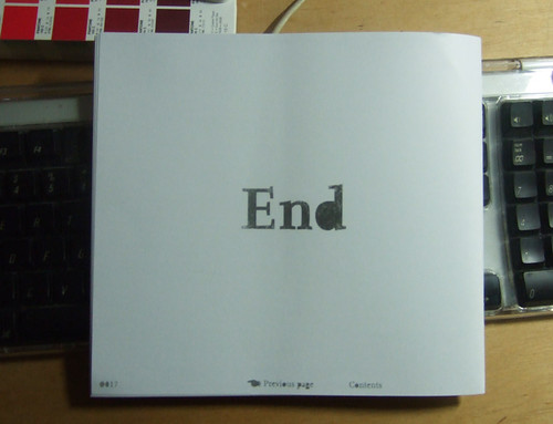
Feeling a bit Douglas Adams in this... Despite the The Crowd Without, Flax018, being my last digital anthology designed for Flax, here's another one.Mostly Truthful is a collection of non-fiction from authors based in the North West of England. For the cover, we were trying to find something a little humorous, a reflection of an information source which claims to be authorative, but not quite (oddly, on the very day I completed this project, I waited a good hour for my wife to arrive in Edinburgh on a train that, according to railway boards not disimilar to this, had been cancelled – the ghost train arrived, unannounced and unheralded about 55 minutes late).
When editor Sarah Hymas saw this cover in its initial idea stage she laughed, so I knew we were in the right area. As the designs for these anthologies have tended to work in pairs, I wanted to move away from the dominantly white, kind of serious looking covers we did in the spring and move to a more lush and amusing style.
Mostly Truthful is available for free download from the litfest website and contains some really nice writing, including an interesting piece by Kate Feld on long term emigration and what it does to our understanding of our youths to be totally immersed in a foreign culture. The digital publication also contains links to the authors reading samples of their work and to their blogs.
If you are in Lancaster today (October 24th) you can pop to the Storey Building and enjoy the launch event which may or may not involve brass band music.
Tuesday, October 6, 2009
Design Jack Website

Another update to my website driven by a client. I've been experimenting with driving Flickr images to a website to create a flexible site for a local (Edinburgh) photographer to showcase her work. I came across the excellent Pictobrowser, a free, online gallery maker which can be embedded in your webpage of blog. So you get much of the convenience of a Content Management System without the database hassle. You can change the images called just by editing your Flickr sets. Alas, only for photos.
Monday, October 5, 2009
North West Playwrights web launch
I really like that the site is blank slate with style, so it will grow as the organisation adds content and will be flexible to carry whatever type of content they put up there. It shows a good development team that can put the urge to over design aside to create something useful for the organisation.
And now for the self-promotion. North West Playwrights asked me to produce a flyer for the launch event for the website. My approach was to give a sneak peak of the site through plain brown wrapping. Chris Bridgman felt a little more should be revealed, so before an after images below.

Sunday, July 19, 2009
Ambition reflects Litfest's ambition
Andy Darby of Litfest has recently been interviews as part of the Art Council North West's Ambition project to encourage the use of IT in the delivery of the arts. In the interview (which you can see here) Andy talks about several of the projects I worked on with the organisation, included the website and blog I templated, various Flax publications, including a poster commission we published on line and a whole lot more.
Fantastic that the organisation has been featured like this as it has been a hard slog for an organisation with such limited time resources to move so far into other forms of delivery in such a short period of time. Andy, Sarah Hymas, Jonathan Bean and Catherine Salder should all be commended for their efforts. And it is great to see my work showcased like this. Make the three years we worked together all the better.
Saturday, July 18, 2009
Passport to Style
Sharon writes a blog to support her Lancaster based style consultancy and chose to use the designs to advise men on the types of designs they might look for. She suggests the colours are flattering to most skin tones and the themes suggest spirituality, energy and strength.
Most of her blog posts feature advice for women on what to where this season. I'm pleased to see that the advice looks back to the classy style of 1950s and 60s Hollywood. Let's face it, there has been no era since that comes close to the class and style of the 50s and 60s. If I could find the old suits again – my old ones are a bit thread bare these days – I'd wear them daily.
Sadly, the designs haven't left my computer (except for blog presence) but I'll hopefully submit these and others to more t-shirt companies in the future.
Thanks Sharon, hope the business goes from strength the strength.
Wednesday, July 1, 2009
Mad dogs and Lancastrians

I've worked with poet, editor, puppeteer and performer Sarah Hymas for three and a half years. She has a definite sense of aesthetic and an openness to outside ideas, and there is something about her that has always made me think of the early modernists, and Art Nouveau's Alfons Mucha's relationship with Sarah Bernhardt. I took a photos Sarah uses on her blog, Echo Soundings to create this image, a hand drawn, slightly distorted version of Sarah's intense performances. The colours and style are drawn directly from modernist traditions. and the energy of her pushing out her own name I find quite dynamic.
Meanwhile, Hilli McManus, set, prop and garden designer extraordinaire, asked me to create business cards. Her starting point was her identity, Hilli the Fish, Monty Python, some semi-nude shots taken of her for a theatre company and a few fishy books borrowed from the local library. And the rest is history, or something similar, photohsop montage perhaps.

Hilli's definite ideas of what she wanted combined with an openness to new ideas made her an ideal friend/client. Like Sarah, she was demanding but direct.
Denizen, interestingly, originally referred to people who had come from elsewhere to inhabit a place, perhaps distinguishing them from citizens. Both Sarah and Hilli have come from across the Pennines, Yorkshire and Newcastle respectively, to inhabit Lancaster. And both have come to represent what is best of the city, an embracing comfort that allows the right artistic minds to prosper.