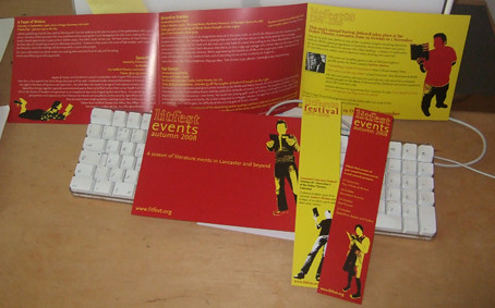
The challenge, then, is to create a design which can be rolled out over three seasons and the festival and not get confusing. My solution was to keep a little from last year's festival (see earlier entries) by using the lone figure reading, and add big, bold block colour. The Autumn season uses Litfest's traditional deep red, while the Festival is to be bright yellow. The images have been pushed, and simplified, and then taken into illustrator to create these striking images. It is also the 30th anniversary of the festival, so we wanted to look back a little to 1978, to the diy aesthetic of punk rock. So I've tried to add a little roughness to the images, but keep the structure of a rigid grid to keep the whole thing accessible and readable.
Below is a photo of the front and inside of the leaflet as well as both sides of the bookmark we've produced to accompany the publicity.
Thanks to the staff of Litfest and Storey Gallery for acting as models, and to Jonathan Bean for the original photos, except the ones of him, of course.


No comments:
Post a Comment