Showing posts with label Litfest Lancaster. Show all posts

Sunday, July 19, 2009

Ambition reflects Litfest's ambition

Andy Darby of Litfest has recently been interviews as part of the Art Council North West's Ambition project to encourage the use of IT in the delivery of the arts. In the interview (which you can see here) Andy talks about several of the projects I worked on with the organisation, included the website and blog I templated, various Flax publications, including a poster commission we published on line and a whole lot more.


Fantastic that the organisation has been featured like this as it has been a hard slog for an organisation with such limited time resources to move so far into other forms of delivery in such a short period of time. Andy, Sarah Hymas, Jonathan Bean and Catherine Salder should all be commended for their efforts. And it is great to see my work showcased like this. Make the three years we worked together all the better.

Friday, May 15, 2009

Litfest Summer 2009


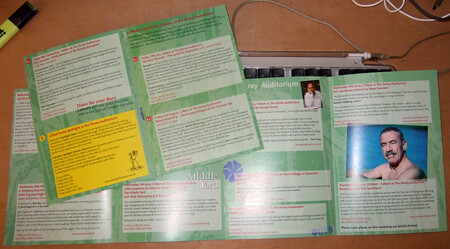
Litfest's Summer programme of readings has begun, and above is the cover and back/calendar of the publicity I designed for it. This season celebrates the return of Litfest to The Storey building, now a centre for creative industries. I took the design which I created for this event years (Autumn, Festival, Spring and Summer) and added the pushed image of the front of the Storey Building (photo by Jonathan Bean of Beanphoto). I seem to often use this method to reduce the subtlety of an image so that it become flat colour. In this case, I reversed it as well so the base colour is white. The text is easier to read on the white and green of the cover, while, with the white further knocked back, black bulk text is accessible. I use this on the insides (below)...
...but a better example of this is the related A4 poster (for want of a better term) I put together of Jacob Polley's Welcome to your mouths and tongues (clicking this link will download the pdf). the method, but the way, is to use levels to increase the black and white (so the contrast) and then eliminate the grey. Then choose the dominant bits, turn it into a path, export the paths to illustrator, open in illustrator and fill the image with whatever colour you choose. You might have to play a little in illustrator, but that's okay.

Thursday, April 9, 2009

David Gaffney's Storey Shorts

Short story writer David Gaffney was commission by Litfest to write stories inspired by the Storey Institute building in Lancaster, which has recently been reopened (confusingly just as The Storey) as a centre for the creative industries. Both Litfest and the Storey Gallery will be housed there.

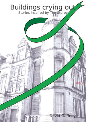
With mere hours (okay, a few days) to go before the launch date, Andy of Litfest asked me to whip up a design for the digital collection of stories, Buildings Crying Out. The resulting cover is below.

The ribbon is a reference to a proposed art project that would have swathed the building in green ribbons. Alas, funding would not allow, but I felt the idea should live some how, even if only on a digital cover.

We decided to experiment with ecofont, a new font designed to use 20% less ink. This may seem like an odd decision, given this is a digital publication, but I will justify it. Firstly, the font has to be able to work in a variety of forms if it is going to have a long and prosperous life. Secondly, the book was designed, unlike previous Flax publications (see below) to be printed as well as read online, so if we are not saving our own ink, perhaps we are saving yours.

Here is a sample page, which doesn't actually show that much, I guess.

To read the book (for free of course) and see how ecofont works, go take a look at the Buildings Crying Out page on the Litfest website.

Saturday, November 29, 2008

Litfest08 Publicity

Another Litfest has come and gone. But this year we were designing for a longer term project, a full, year long programme. In the past, Litfest has used red as it's identifying colour – almost all the publicity has been largely red. But now we had to differentiate three seasons and the festival. So, to brighten the publicity up and give the festival a distinctive look, I introduced a bright yellow. The idea was to make the publicity stand out on shelves and posters leap out of windows.

This year was Litfest's 30th anniversary, so we tried to harken back a little to a bit of a punk-rock DIY aesthetic with the reading characters looking a little rough around the edges, like a photocopy. But the layour needed to be clean and readable, as usual, and accessible to the festival's core audience.

The right hand page above publicises the festival's final event, a spoken word event which will result in an online ep which will be available at www.litfest.org soon.

And below is the back cover with the calendar of events, neatly laid out so you can find the show you want to go to. The open spread advertises two special events, one for The Midland book, and the other for a Litfest programme of continuing professional development.


Below are the posters designed for the Waterstones shop on King Street in Lancaster. Again, big, bold and attention seeking. Photo by Jonathan Bean.

And one quad poster posted outside the main venue, the Dukes (also taken by Jonathan, who might also be the model for the character on the poster).

Wednesday, September 3, 2008

Litfest Autumn Events Publicity

Litfest has set another new challenge for me. For the past couple of year, I've designed the publicity for their annual festival. This year, there is an added complication of a season of events which just precedes the festival itself.

The challenge, then, is to create a design which can be rolled out over three seasons and the festival and not get confusing. My solution was to keep a little from last year's festival (see earlier entries) by using the lone figure reading, and add big, bold block colour. The Autumn season uses Litfest's traditional deep red, while the Festival is to be bright yellow. The images have been pushed, and simplified, and then taken into illustrator to create these striking images. It is also the 30th anniversary of the festival, so we wanted to look back a little to 1978, to the diy aesthetic of punk rock. So I've tried to add a little roughness to the images, but keep the structure of a rigid grid to keep the whole thing accessible and readable.

Below is a photo of the front and inside of the leaflet as well as both sides of the bookmark we've produced to accompany the publicity.


Thanks to the staff of Litfest and Storey Gallery for acting as models, and to Jonathan Bean for the original photos, except the ones of him, of course.

Tuesday, August 12, 2008

Prison Project Posters

In addition to literature events and publishing, Litfest produces a programme of projects in the general community – or in this case just outside of the general community. Projects Manager Catherine Sadler has sweat blood to organise education projects in a number of prisons in Lancashire, bringing writers and artists in to work with inmates, from young people to high security prisoners. As a part of this, I was asked to produce an eye catching A3 poster which would stand out on busy notice boards.


Catherine suggested the Radio, Radio, I suspect because she had been listening to a bit of Elvis Costello, and I just kind of took it from there. My approach to this kind of project is produce something colourful, bright and professional, something a good solid step up from the usual institutional work you might find in places like prisons. Its not just to get noticed, but in the hope it might have some small affect on spirits.

This is the third poster I've designed for this kind of work. The first was for a photography project for young people on parole organised by Folly Gallery (a microscope image of a fly in the cross hairs of a camera lens) and the second for a writing project involving Litfest, a Lancashire Prisons and Central Lancaster University (below), which was adapted for the book cover.

Friday, December 7, 2007

Litfest 2007

Litfest 2007 has been and gone and as usual it was busy and like last year, quite successful.

Below is a photo of the local Waterstones window with the 5ft tall posters. The photos are taken by Jonathan Bean which I manipulated. The banner was the identity for the festival and seemed to work. One of these posters was more or less stolen (demanded and taken away) as they were being taken down at the end of the festival, we are hoping the culprit a) isn't the model stalker and b) will return it for our archives.


Below is the pre-brochure leaflet (from it's proof), inside on the left, outside on the right and the big photo is Sarah Hall, or Carhullan Army and The Electric Michelangelo fame. And below that is a flyer for the mighty Linton Kwesi Johnson, who was amazing to see, such a powerful performer and poet.


And finally the cover of the brochure itself (again photo by Jonathan Bean)

Thanks to Penny Darby, the marketing officer for Litfest, and the rest of litfest for allowing and helping me to do this again. Despite the fun and games of trying to get something like Litfest organised, the design can be great fun and I'm pretty proud of the results.