 I was glad to see a Litfest and Flax blog with this lovely virtual bookshelf of the digital publications I designed for them as they were uploaded to Issu. Nice to see them all collected together, even if the two at the top left have lost some of their transparency.
Showing posts with label book design. Show all posts
Showing posts with label book design. Show all posts
Saturday, November 28, 2009
Flax books on Issu Bookshelf
I was glad to see a Litfest and Flax blog with this lovely virtual bookshelf of the digital publications I designed for them as they were uploaded to Issu. Nice to see them all collected together, even if the two at the top left have lost some of their transparency.

Saturday, June 20, 2009
The Crowd Without, Flax018, poetry from Flax
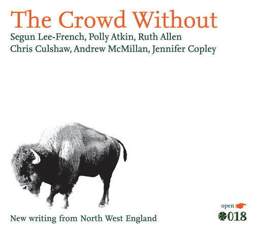 For three and a bit years I have worked part time with Litfest, a literature festival and literature development agency in Lancaster. They have underpinned my freelance business, but now, as I've moved to Edinburgh, I've had to make the difficult decision to leave the warm comfort of the organisation.
Above is the final item I produced for Litfest, The Crowd Without, an anthology of new poetry. Working with editor Sarah Hymas, I've helped create six anthologies. In our efforts to create a comfortable, online reading experience with added bells and whistles– like links to audio files of the author's reading from the work and to online biographies – we've asked questions, experimented, got it wrong, got it right and started all over again. The most recent pair – though I never intended them to be pairs – are the one's I'm most proud of. They are clean, a little edgy and mysterious and read well without being stuffy.
Thanks to Sarah for her help and support on this and their predecessors, as well as Jonathan for his photography work and confirming eye and Andy for his hands off guidance of the process.
The Crowd Without and the short story anthology Unsaid Undone are available for free download from the Litfest website, on the Flax page. They are well worth a read, featuring some excellent new voices from the North West of England.
Thursday, April 9, 2009
David Gaffney's Storey Shorts
Short story writer David Gaffney was commission by Litfest to write stories inspired by the Storey Institute building in Lancaster, which has recently been reopened (confusingly just as The Storey) as a centre for the creative industries. Both Litfest and the Storey Gallery will be housed there.
With mere hours (okay, a few days) to go before the launch date, Andy of Litfest asked me to whip up a design for the digital collection of stories, Buildings Crying Out. The resulting cover is below.

The ribbon is a reference to a proposed art project that would have swathed the building in green ribbons. Alas, funding would not allow, but I felt the idea should live some how, even if only on a digital cover.
We decided to experiment with ecofont, a new font designed to use 20% less ink. This may seem like an odd decision, given this is a digital publication, but I will justify it. Firstly, the font has to be able to work in a variety of forms if it is going to have a long and prosperous life. Secondly, the book was designed, unlike previous Flax publications (see below) to be printed as well as read online, so if we are not saving our own ink, perhaps we are saving yours.
Here is a sample page, which doesn't actually show that much, I guess.

To read the book (for free of course) and see how ecofont works, go take a look at the Buildings Crying Out page on the Litfest website.
With mere hours (okay, a few days) to go before the launch date, Andy of Litfest asked me to whip up a design for the digital collection of stories, Buildings Crying Out. The resulting cover is below.
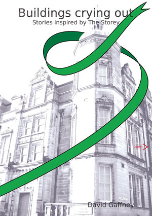
The ribbon is a reference to a proposed art project that would have swathed the building in green ribbons. Alas, funding would not allow, but I felt the idea should live some how, even if only on a digital cover.
We decided to experiment with ecofont, a new font designed to use 20% less ink. This may seem like an odd decision, given this is a digital publication, but I will justify it. Firstly, the font has to be able to work in a variety of forms if it is going to have a long and prosperous life. Secondly, the book was designed, unlike previous Flax publications (see below) to be printed as well as read online, so if we are not saving our own ink, perhaps we are saving yours.
Here is a sample page, which doesn't actually show that much, I guess.

To read the book (for free of course) and see how ecofont works, go take a look at the Buildings Crying Out page on the Litfest website.
Tuesday, July 15, 2008
Flax Books (print)
Before the Rain and West Coast, North Hill

These two books have been out for some time, but I've not figured out how to show them. But I've figured, just take the shots and pop them up. Above are the covers for both books, below are some spreads, including the sub-title page. The font we use for Flax is the Nexus family. I'm particular fond of the serif version, it has amazing little little features. Before the Rain features the isobars of a weather front passing over Britain, bringing rain, of course.


The books are available from www.litfest.org or you can buy it in person from Litfest events which begin in September. Better get the publicity done, then.
These two books have been out for some time, but I've not figured out how to show them. But I've figured, just take the shots and pop them up. Above are the covers for both books, below are some spreads, including the sub-title page. The font we use for Flax is the Nexus family. I'm particular fond of the serif version, it has amazing little little features. Before the Rain features the isobars of a weather front passing over Britain, bringing rain, of course.
The books are available from www.litfest.org or you can buy it in person from Litfest events which begin in September. Better get the publicity done, then.
Subscribe to:
Posts (Atom)


 Posts
Posts

