Monday, October 5, 2009

North West Playwrights web launch

Congratulations to Chris Bridgman and the rest of the North West Playwrights team on the recent launch of their new website. I'm sure there was a lot of hand wringing and heated discussions, but it looks like the results are great. The site was designed by Chameleon Interactive, who look like they do a lot of work in the arts and charity sectors.

I really like that the site is blank slate with style, so it will grow as the organisation adds content and will be flexible to carry whatever type of content they put up there. It shows a good development team that can put the urge to over design aside to create something useful for the organisation.

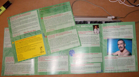
And now for the self-promotion. North West Playwrights asked me to produce a flyer for the launch event for the website. My approach was to give a sneak peak of the site through plain brown wrapping. Chris Bridgman felt a little more should be revealed, so before an after images below.


Sunday, July 19, 2009

Ambition reflects Litfest's ambition

Andy Darby of Litfest has recently been interviews as part of the Art Council North West's Ambition project to encourage the use of IT in the delivery of the arts. In the interview (which you can see here) Andy talks about several of the projects I worked on with the organisation, included the website and blog I templated, various Flax publications, including a poster commission we published on line and a whole lot more.


Fantastic that the organisation has been featured like this as it has been a hard slog for an organisation with such limited time resources to move so far into other forms of delivery in such a short period of time. Andy, Sarah Hymas, Jonathan Bean and Catherine Salder should all be commended for their efforts. And it is great to see my work showcased like this. Make the three years we worked together all the better.

Saturday, July 18, 2009

Passport to Style

Sharon Gibson has featured my t-shirts designs on her Passport to Style blog.

Sharon writes a blog to support her Lancaster based style consultancy and chose to use the designs to advise men on the types of designs they might look for. She suggests the colours are flattering to most skin tones and the themes suggest spirituality, energy and strength.

Most of her blog posts feature advice for women on what to where this season. I'm pleased to see that the advice looks back to the classy style of 1950s and 60s Hollywood. Let's face it, there has been no era since that comes close to the class and style of the 50s and 60s. If I could find the old suits again – my old ones are a bit thread bare these days – I'd wear them daily.

Sadly, the designs haven't left my computer (except for blog presence) but I'll hopefully submit these and others to more t-shirt companies in the future.

Thanks Sharon, hope the business goes from strength the strength.

Wednesday, July 1, 2009

Mad dogs and Lancastrians

In the months before I left Lancaster, I had the fortune of being asked by two of its more creative denizens to create business cards and other stationary for them. Both are free spirited, open minded artists, though of quite different artistic temperaments.


I've worked with poet, editor, puppeteer and performer Sarah Hymas for three and a half years. She has a definite sense of aesthetic and an openness to outside ideas, and there is something about her that has always made me think of the early modernists, and Art Nouveau's Alfons Mucha's relationship with Sarah Bernhardt. I took a photos Sarah uses on her blog, Echo Soundings to create this image, a hand drawn, slightly distorted version of Sarah's intense performances. The colours and style are drawn directly from modernist traditions. and the energy of her pushing out her own name I find quite dynamic.

Meanwhile, Hilli McManus, set, prop and garden designer extraordinaire, asked me to create business cards. Her starting point was her identity, Hilli the Fish, Monty Python, some semi-nude shots taken of her for a theatre company and a few fishy books borrowed from the local library. And the rest is history, or something similar, photohsop montage perhaps.


Hilli's definite ideas of what she wanted combined with an openness to new ideas made her an ideal friend/client. Like Sarah, she was demanding but direct.

Denizen, interestingly, originally referred to people who had come from elsewhere to inhabit a place, perhaps distinguishing them from citizens. Both Sarah and Hilli have come from across the Pennines, Yorkshire and Newcastle respectively, to inhabit Lancaster. And both have come to represent what is best of the city, an embracing comfort that allows the right artistic minds to prosper.

Saturday, June 20, 2009

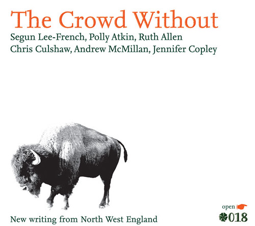
The Crowd Without, Flax018, poetry from Flax

For three and a bit years I have worked part time with Litfest, a literature festival and literature development agency in Lancaster. They have underpinned my freelance business, but now, as I've moved to Edinburgh, I've had to make the difficult decision to leave the warm comfort of the organisation.

Above is the final item I produced for Litfest, The Crowd Without, an anthology of new poetry. Working with editor Sarah Hymas, I've helped create six anthologies. In our efforts to create a comfortable, online reading experience with added bells and whistles– like links to audio files of the author's reading from the work and to online biographies – we've asked questions, experimented, got it wrong, got it right and started all over again. The most recent pair – though I never intended them to be pairs – are the one's I'm most proud of. They are clean, a little edgy and mysterious and read well without being stuffy.

Thanks to Sarah for her help and support on this and their predecessors, as well as Jonathan for his photography work and confirming eye and Andy for his hands off guidance of the process.

The Crowd Without and the short story anthology Unsaid Undone are available for free download from the Litfest website, on the Flax page
. They are well worth a read, featuring some excellent new voices from the North West of England.

Thursday, June 11, 2009

t-shirt Designs


I recently spent a few days working up some designs to submit to Ltd Ink's launch of a new series of t-shirts. Sadly I designed for adults and the ones they chose were a bit younger, perhaps, so none were picked (I'm sure there are other reasons as well).
Above is one I designed working from a photo taken from Kate Rawles Carbon Cycle (with permission, of course) webiste (which I designed a few years back). Wind Power is Beautiful, Baby is a celebration of the elegant technology of the Wind Turbine.

In the Glory of the Beest is another photograph based one, just a lovely image, I think. Initially it was to be The Love Beest, with a big heart, but I decided I preferred the rays of sunshine.
Below are two more joking ones, Ernesto's Original Argentinian Bar and Grill and Molotov's Cocktail Bar, imagining what Cold Warriors might have ended up doing had they not been Cold Warriors. They go along with Big Ron's Seven Step Program for Failed Actors and The Dulles Brother's Fruit Stand.

Friday, May 15, 2009

Litfest Summer 2009


Litfest's Summer programme of readings has begun, and above is the cover and back/calendar of the publicity I designed for it. This season celebrates the return of Litfest to The Storey building, now a centre for creative industries. I took the design which I created for this event years (Autumn, Festival, Spring and Summer) and added the pushed image of the front of the Storey Building (photo by Jonathan Bean of Beanphoto). I seem to often use this method to reduce the subtlety of an image so that it become flat colour. In this case, I reversed it as well so the base colour is white. The text is easier to read on the white and green of the cover, while, with the white further knocked back, black bulk text is accessible. I use this on the insides (below)...
...but a better example of this is the related A4 poster (for want of a better term) I put together of Jacob Polley's Welcome to your mouths and tongues (clicking this link will download the pdf). the method, but the way, is to use levels to increase the black and white (so the contrast) and then eliminate the grey. Then choose the dominant bits, turn it into a path, export the paths to illustrator, open in illustrator and fill the image with whatever colour you choose. You might have to play a little in illustrator, but that's okay.

Sunday, May 10, 2009

Welcome to the Dance

Going through my portfolio, weeding out older stuff and found this, my first commission some eight or nine years ago. Welcome to the Dance is a book of writing produced in long term care in and around Bristol and was published by Poetry Can, Bristol's poetry development agency.

We were trying to give a sense of loneliness without despair. The disco ball in the corner and the light from the bottom right are meant to give a sense of hope and somewhere to go, a bit like dawn.

I wonder what Hester Cockroft is doing these days.

Monday, May 4, 2009

When you need a hand (Ms Diva's Khabaloush)

Ms Diva is a small but vital theatre company who devised a mad sounding play which took place last week (sorry, should have blogged this earlier) at the Contact Theatre in Manchester. Hanneke Blower, one of the principles was left in a spot, designing her own publicity at the last minute, so I offered some help and this is the result. A quick, but lovely job to do. Font is Unit Rounded.

Hope it went well, Hani.

Monday, April 27, 2009

Jenn Ashworth's All Stood Together


Late last week Jonathan at Litfest posted most, if not all, of Litfest and Flax's publishing output up on the writing social media space, scribd. Since then, the books, posters and what not have received a pretty good number of hits, the recently published Unsaid, Undone, for example, has been viewed 43 times in the last five days. Jenn Ashworth's All Stood Together poster (designed by yours truly) has been viewed a whopping 1500 times and counting in the same period.

Jenn's lovely very short fiction is one of six posters Flax published last November all of which can be viewed on the Poster Commissions page of Litfest's site. There are three poems and three short stories. If you like them you can download the A3 printable versions and print them at home – yep Flax are giving them away. And two are available for purchase.