
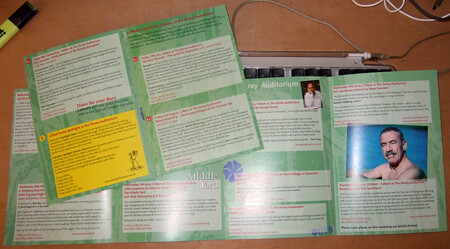
Litfest's Summer programme of readings has begun, and above is the cover and back/calendar of the publicity I designed for it. This season celebrates the return of Litfest to The Storey building, now a centre for creative industries. I took the design which I created for this event years (Autumn, Festival, Spring and Summer) and added the pushed image of the front of the Storey Building (photo by Jonathan Bean of Beanphoto). I seem to often use this method to reduce the subtlety of an image so that it become flat colour. In this case, I reversed it as well so the base colour is white. The text is easier to read on the white and green of the cover, while, with the white further knocked back, black bulk text is accessible. I use this on the insides (below)...
 ...but a better example of this is the related A4 poster (for want of a better term) I put together of Jacob Polley's Welcome to your mouths and tongues (clicking this link will download the pdf). the method, but the way, is to use levels to increase the black and white (so the contrast) and then eliminate the grey. Then choose the dominant bits, turn it into a path, export the paths to illustrator, open in illustrator and fill the image with whatever colour you choose. You might have to play a little in illustrator, but that's okay.


